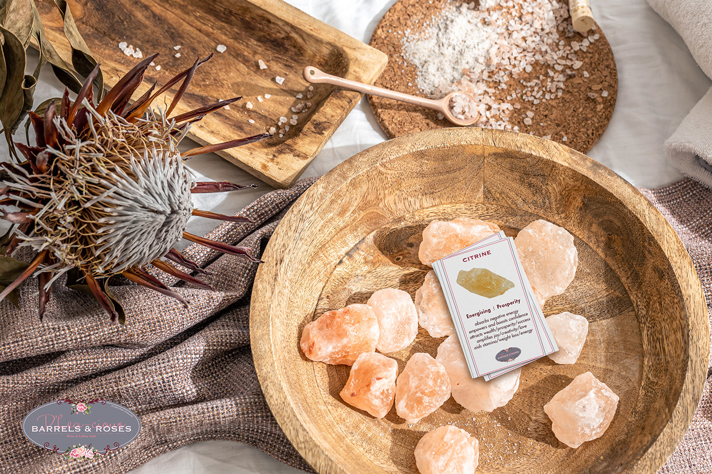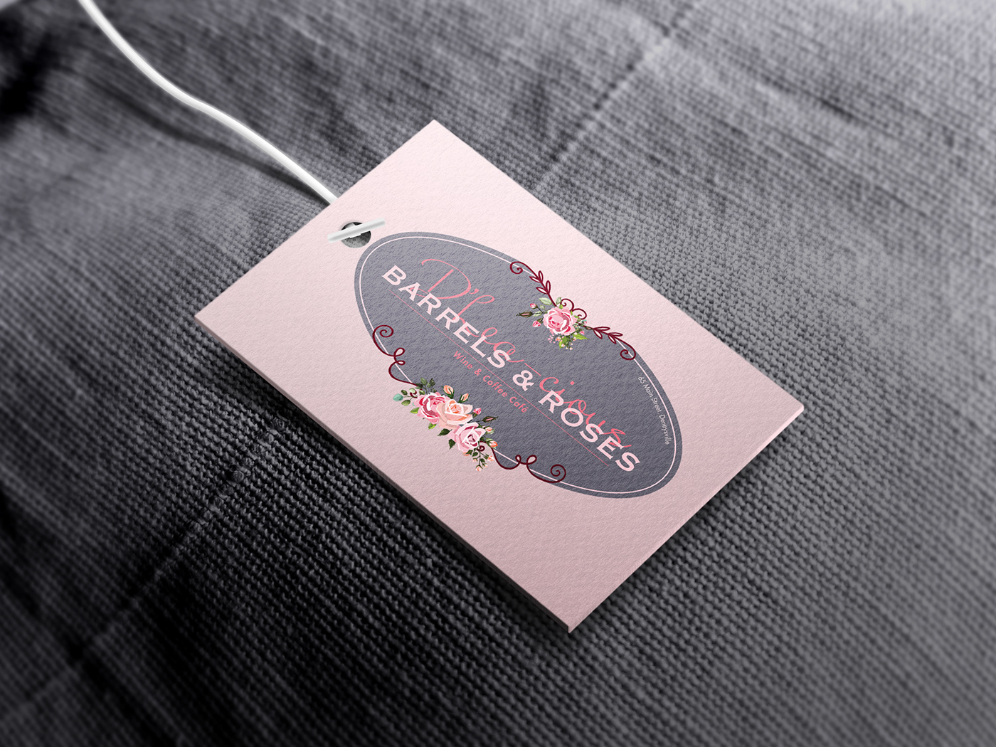
Barrels & Roses / D'Lea-cious
Wine & Coffee Cafe
An updated logo design that merges two parts of the client's business together by incorporating existing elements alongside new and updated ones.
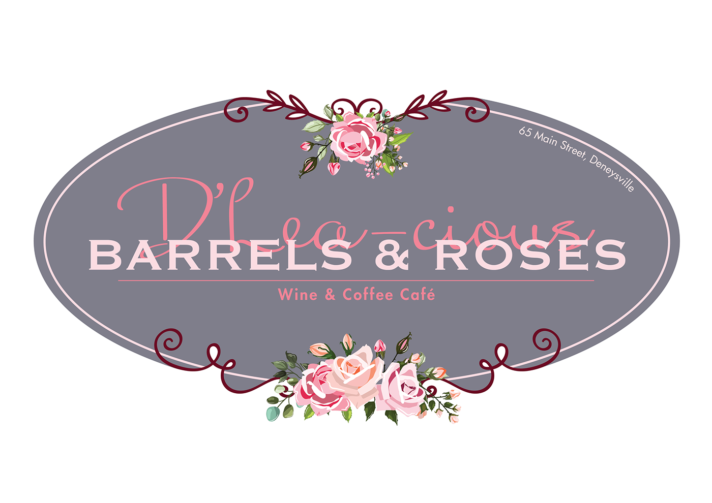
Background and Concept
For this design, the client's brief entailed bringing together two parts of their business, one that was the original and one that was a newer adventure. They wanted to merge the two to create one seamless logo design that could then be used in a number of different ways. The client also really wanted to make use of the roses that are seen in the final logo.
After researching into the brief and speaking with the client, the final concept formed focused on the idea of merging. Bringing together and highlighting a contrast allowed for the two parts to stand out but also form a whole. The logo speaks to a softer, more feminine side, however, there are also elements that contrast this such as in the solid stamp-like typeface of "Barrels & Roses" and the negative space cut-outs.